Posts

Sophomore final

Image
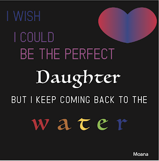
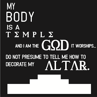
So here's a little reflection on all of my favorite second semester projects. I'm supposed to pick three, which should be easy because second semester was my jam. typography So my first favorite of semester two was the typography project. It took me around three weeks or so to complete. I had to pick song lyrics/quotes, typefaces, format them, make graphics, etc. I had a lot of trouble deciding what quotes to do, since a lot of the music or quotes I had listed meant a lot to me. I learned a lot about balance and typeface, how to make more words look more emphasized than others. I was told often to add more graphics, lines, etc. and I did. but I also really liked the empty minimalist feel. I stuck mostly to the ideas I had in my head, except for maybe the bi heart. the gradients were finicky. I just.. I really liked it?? it sparked joy???? that's why I like a lot of these projects. vector  another one I really enjoyed was the vector graphics. that took

RIP my little poopy butt- a vector portrait

Image
Afro, my cat, died September something, 2018! he was eighteen, skinny, old and loved to cuddle. he was practically on death's door, so I was pretty alright when he was put down. Rip my little buttface. to pay respect to my scruffy little baby, I decided to use this picture of him for the vectored portrait. isn't he adorable?????? it didn't take long to like... crop anything. unfortunately, when I tried to posterize him, it didn't end up well. so I just used the organic picture. there was enough clear contrast that it was easy :D! I would truly like to thank my friend, Eli for giving me tips for illustrator; he taught me about the pen curve tool (just below the pen tool) and it saved my life. this prevented the portrait from becoming too chunky, and smoothed out areas. so that ended up pretty well. overall it was fairly easy, it was just truly tedious. which I didn't mind, it was therapeutic in a way. I organized by layer: white, grey, face, ears, eyes, etc. e

typography!!!!

Image
   this was was pretty fun to say the least. So, if you don't know, Typography is that live-laugh-love type stuff that your mom posts on facebook. they're cheesy, but pretty. I, personally like them, depending on the quote. so at first, we had to think of ten quotes, then pick four to make into a black and white typography. here they are: pardon their blurriness, but still. I chose lyrics that either I chose or my best friend, who loves lyrics. weirdo. I chose two basic fonts, one serif and one sans serif, which you can see are both used in the last one. I then chose some accent fonts for emphasis, which can be seen in the first three. next, we had the option to color the four we already did, or four new ones. I chose four new ones, since these looked good on their own. here those are:    I feel like I'm getting more comfortable with illustrator, considering I made that Jekyll profile with the pen tool. that heart gave me a lot of hell, howev

performance review I guesss

Image
alright so I'm supposed to show like two projects and review them and stuff. if you can't tell, I'm VERY done right now, I'm exhausted. whatever. here we go. so as you can see, you have already seen this. it's Julia and Jared. yippee. the first one was a popart project, and the other one was like,, something with Photoshop 101. both of them didn't take very long. how long did it take? julia took like... a week, and jared took two days. you can see which one I liked better, clearly. any issues? I didn't have any problems with Julia, she was easy. jared, however. his hair was so hard!!! I relied heavily on effects to make it look at least semi decent. good critique? I didn't get a lot of critique. or at least... useful ones. I'm sorry, but like?? criticizing the color pallet isn't really critique, Helen (she doesn't exist it's a white girl insult). what did you learn? I mostly learned how to use the Wacom, it was pretty d

my own prints!

Image
So I made my own prints, hooray! they're at my home at the moment, and I'm giving one to Emily, and another to my mom, for Christmas. I made these using the following steps: converting the press in photoshop creating the watercolor cutting the printed press gluing it on with mod podge, a thick layer letting it dry using wet fingers, rubbing off the excess paper I pretty much struggled little to none, this was incredible easy. I'd love to do this again!

Printing

Image
printing has been around since medieval times, thanks to the Gutternberg Printing press. If it weren't for printing, we wouldn't have lutheranism, books, or modern pop art drawings. Today, artist use printing as a type of media. There are three main types: Relief, Lithography, and Intaligo. R E L I E F- cutting into wood to make a stamp --------------- 1. coat wood cut in washed down India ink 2. Transfer the drawing via a carbon transfer or other methods 3. either use white line* or black line** composition to make the "stamp.     *white line is taking away black     **Black line is adding black 4. roll ink over the stamp 5. run it through the press 6. whoop there it is L I T H O G R A P H Y- drawing onto a specific stone, covering it in powder and greasing up boi ------------------------------ 1. draw a picture onto the stone 2. cover in talc or rosin. or both, your choice man. 3. rub the excess off 4. coat in Gum Arabic 5. apply TAPEM, acid gum

*~P A N O R A M A ~*

Image
6:35 AM.   A rainy Monday morning.   You sigh, the weight of your damp backpack being shrugged off of your shoulders as you set it on the other side of your seat on the bus. You lay your head onto the side window of the bus, but quickly pull it away as you feel your brain turn into a smoothie. You suppose you'll just crane your neck to check your surroundings.   The rain is almost ended, the golden yellow, peaches and blues peeking through the clouds. little rays of sunlight peek through as well, as if the hypothetical heaven itself was showing itself through the clouds. It could be a metaphor for depression, and recovery, or it could perhaps be a sign that it's going to be okay.   The world is at a standstill, very few cars are out. it's as if reality itself is altered, that you would be in a parallel universe. it's... peaceful. tranquil. that's all folks, this is a panorama project I did. this was taken with ten sunset photos I took onto the bus, or