Posts

Showing posts from November, 2017

The Oz Poster

Image
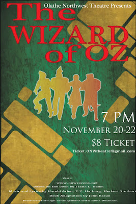
Contrast The contrast in this poster I edited can be seen in the use of red for the title, to contrast with the green and gold background. I made the characters gold, but to contrast even more, I used a gradient effect. You can also see contrast in the size of the typeface. The credits are in fine print, while the information is in a medium, white text. The title is the most important, so it's the largest. Alignment I aligned the title in a way that stands out, because it's supposed to stand out like that. the T and the  W  are aligned with each other as well, along with the Z, O, R, and   O. I did this because I didn't like how the entire poster looked when it was left aligned, and wanted it to be a little more in the center, but not exactly center aligned. I also right alines the ticket information as a form of contrast, and to show of the gold bricks drawn in the background. I center aligned the fine print in order to make room for all of it.  Repetition

typography project

Image
Let's get this post started! This project focused on typography terminology. The E9 class was to type out their name in Sans Serif, and label ten parts of the typeface. This was my contribution. I apologize for the O. I couldn't figure out how to fill that in, so I had to freehand it.  What did I learn? I learned that my name doesn't line up in the Sans Serif font. This bothered me. A lot. I id the project nonetheless. I learned that I'm actually quite talented at freehand and editing, and that arrow shape number four is a good favorite of mine. I mean... Look at it! How did it go? I feel like it went very well! Some things I did were easy, like typing my name, putting the lines on there, and labelling. however, some things were difficult as well. I couldn't figure out how to fill in the counter of the O, so I freehanded it. I really enjoyed this project, and I can't wait to do more!

Color schemes

Image
Analogous This logo uses the analogous color scheme, using the colors green, lime green, and yellow. I think it uses these colors to show an optimistic, Eco-friendly oil company. This logo uses the Analogous color scheme, using the colors green, lime and teal. I think it uses these colors to show a healthy, Eco-friendly and reliable company that is welcoming. Complimentary This logo uses the complimentary color scheme, using blue and orange. I think that they use these colors to show that they're welcoming, trustworthy and youthful; also that they're confident. This logo uses the complimentary color scheme, using red and green. I think they use these colors to show that they're energetic, yet harmonious. Red is also used to invoke hunger in people. Warm This logo uses the warm color scheme, using the colors red and yellow. I think that they use these colors because they want to invoke hunger in people, show that they're energetic yet kid