Posts

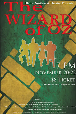
The Oz Poster

Image
Contrast The contrast in this poster I edited can be seen in the use of red for the title, to contrast with the green and gold background. I made the characters gold, but to contrast even more, I used a gradient effect. You can also see contrast in the size of the typeface. The credits are in fine print, while the information is in a medium, white text. The title is the most important, so it's the largest. Alignment I aligned the title in a way that stands out, because it's supposed to stand out like that. the T and the  W  are aligned with each other as well, along with the Z, O, R, and   O. I did this because I didn't like how the entire poster looked when it was left aligned, and wanted it to be a little more in the center, but not exactly center aligned. I also right alines the ticket information as a form of contrast, and to show of the gold bricks drawn in the background. I center aligned the fine print in order to make room for all of it.  Repet...

typography project

Image
Let's get this post started! This project focused on typography terminology. The E9 class was to type out their name in Sans Serif, and label ten parts of the typeface. This was my contribution. I apologize for the O. I couldn't figure out how to fill that in, so I had to freehand it.  What did I learn? I learned that my name doesn't line up in the Sans Serif font. This bothered me. A lot. I id the project nonetheless. I learned that I'm actually quite talented at freehand and editing, and that arrow shape number four is a good favorite of mine. I mean... Look at it! How did it go? I feel like it went very well! Some things I did were easy, like typing my name, putting the lines on there, and labelling. however, some things were difficult as well. I couldn't figure out how to fill in the counter of the O, so I freehanded it. I really enjoyed this project, and I can't wait to do more!

Color schemes

Image
Analogous This logo uses the analogous color scheme, using the colors green, lime green, and yellow. I think it uses these colors to show an optimistic, Eco-friendly oil company. This logo uses the Analogous color scheme, using the colors green, lime and teal. I think it uses these colors to show a healthy, Eco-friendly and reliable company that is welcoming. Complimentary This logo uses the complimentary color scheme, using blue and orange. I think that they use these colors to show that they're welcoming, trustworthy and youthful; also that they're confident. This logo uses the complimentary color scheme, using red and green. I think they use these colors to show that they're energetic, yet harmonious. Red is also used to invoke hunger in people. Warm This logo uses the warm color scheme, using the colors red and yellow. I think that they use these colors because they want to invoke hunger in people, show that they're energetic yet kid...

Color wheel

Image
look at this amazing work of art So what did you do? I drew a color wheel in Adobe illustrator. a color wheel is pretty self explanatory, it's a wheel of color. As you can see, it shows primary, secondary, and tertiary colors. to make this lovely masterpiece, I used select tools, fill tools and shape tools; mostly via shortcuts (by the way, shout out to Elliot Adams for teaching me a few of those.) What did I get out of this? I learned the basic shortcut tools, first of all. I now know the basics of adobe illustrator, and I learned that for tertiary colors, you have to put the primary first. ( prime  example: red orange... get my joke?) I also learned how to make shapes line up, and how to copy and paste the short way (option and drag) How did you do, then? I feel like I did great! I know a lot of shortcuts now, and I think I would be lost without my good friend to help me with that. I think one thing I would do  differently  is that I wou...

the AB project

Image
 alright, I must confess, this was quite fun Avery was a fantastic partner to work with. I've known her for a while as I met her at a anime club in 7th grade, so when Zimmerli said to choose our partners, I immediately knew who I was going to work with. our interests and abilities compared well to each other, as I drew the storyboard and played the actor, while she filmed and thought about most of the process. I learned a lot about the six-shot sequence, and that order is important. for instance, you can't have an extreme close up, and then a regular close up in the next shot. you have to have a close up, then an extreme close up. we discussed this intently in the storyboard process. as I've said before, I was the one that drew it up, however Avery contributed greatly with her creative ideas. our story was that the student (yours truly) is in the bathroom a few minutes before the bell rings, and wants to get out of school before the halls get crowded. so, she runs a...

The Document Project

Image
let's talk about the creative process the creative process went significantly smoother than the sidewalk chalk project, I'm just gonna say that. the team that I worked with was quite skilled, we had a photographer who knew how to work a camera, and someone who already had a general idea on how to use Adobe Premiere. unfortunately, one of my team members was unable to make it as she had cheer, but she did throw out some good ideas in the storyboard process. I was the one who drew the storyboard itself. it was messier than I thought it would be, and I wish it was smoother. as for a script, we didn't really have one, unless you count the storyboard and blocking.  since the cheerleader was absent, which I understand, I had to step up and play actress. the other two, the photographer and the genius, took turns with the camera. overall it was a little uncomfortable at first, but I quickly got used to my roll as the dumb freshman who couldn't print a document that had a...

Sidewalk Chalk Project

Image
let's get this introduced. We all learn something from a team building project. even if it's little to nothing, you still get something into your somewhat undeveloped teenage brain. what I learned I learned very little. given, I already had a good idea of symbolism and colors, but then again, I actually had no idea the sheer amount of symbolism in everything. even olives have something in them (in case you never knew, it means peace or victory- no wonder olive oil is so great!) but I digress. color is rather important too, as we all know. Red often represents anger, blue sadness, white purity. you get the gist of it. let's get this process explained! I'm actually rather unsure how we incorporated this process into the sketching part of the project, so I may nitpick to get this part. Michael decided to put red streaks on the pure white feathers of our glorious, dancing, viola playing potato (whatever a viola is.) which, I assume would mean we flew away with ange...