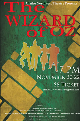
The Oz Poster
Contrast
The contrast in this poster I edited can be seen in the use of red for the title, to contrast with the green and gold background. I made the characters gold, but to contrast even more, I used a gradient effect. You can also see contrast in the size of the typeface. The credits are in fine print, while the information is in a medium, white text. The title is the most important, so it's the largest.
Alignment
I aligned the title in a way that stands out, because it's supposed to stand out like that. the T and the W are aligned with each other as well, along with the Z, O, R, and O. I did this because I didn't like how the entire poster looked when it was left aligned, and wanted it to be a little more in the center, but not exactly center aligned. I also right alines the ticket information as a form of contrast, and to show of the gold bricks drawn in the background. I center aligned the fine print in order to make room for all of it.
Repetition
the repetition used in this poster can be seen in the typeface and color of the title being red. it's also seen in the fine print and information, being in the same typeface and being white. I used the same color as the gold bricks for the characters, but added a gradient as well.
Proximity
to make the title bigger, I adjusted the kerning of it, so I could fit it all on the page. along with that, I spaced the "ONW theatre presents" close to the title, and to the top of the page, since it isn't that important, but your eyes would drift to it anyway. the information on the right and close together so you can see it as a whole, and get the stuff you need in order to see the show.


Comments
Post a Comment