My Very Own Logo
the process
Let me tell you. This one was a wild ride.
At first, I really wanted a lilac alien (a wink and a nod to my alias online as an artist) with clouds and stars as a gradient (to show I was up in space all the time). However, my illustrator skills are relatively sub par, and my brain just shut down at that point. So, aliens were out of the question.
But what was something else that I really liked, and was simple to draw with a mouse?
cats.
This logo took little to no skill at all, and doing everything took me less than a day. Isn't that crazy?!
I started out by drawing a black and white version, then other different colored versions, which looked like this:
The one I chose didn't have a name when I saved this, I don't know why that happened. Just ignore it. Anyway, I chose the top right one. The reason of the colors and shapes are up next.
 |
| imagine if I actually used one of these... |
Colors and Shapes
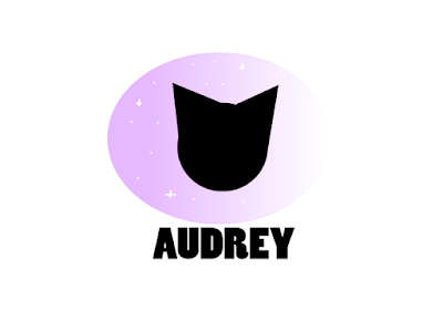
The first shape that you notice is the gradient oval, which I used because it's a good basis for a logo while also applying a slight contrast to the circular shape of the kitty cat. I chose a gradient of lilac as a wink and a nod to my art alias, The Lilac Alien. The two triangles and a circle is supposed to represent the cat, as I really like cats and relate to them pretty well. I chose to make the cat black as an act of contrast and to represent the darkness of my cold heart.
I chose that particular typeface because I couldn't find the bubble letters that I wanted, to show that I was bold and sometimes even bubbly. It still works though, as I'm also quite sharp.
Overall, I'm quite happy with the finished project, and I may even use it as a brand logo for my future webcomic.


Comments
Post a Comment