Posts

Showing posts with the label CARP

RIP my little poopy butt- a vector portrait

Image
Afro, my cat, died September something, 2018! he was eighteen, skinny, old and loved to cuddle. he was practically on death's door, so I was pretty alright when he was put down. Rip my little buttface. to pay respect to my scruffy little baby, I decided to use this picture of him for the vectored portrait. isn't he adorable?????? it didn't take long to like... crop anything. unfortunately, when I tried to posterize him, it didn't end up well. so I just used the organic picture. there was enough clear contrast that it was easy :D! I would truly like to thank my friend, Eli for giving me tips for illustrator; he taught me about the pen curve tool (just below the pen tool) and it saved my life. this prevented the portrait from becoming too chunky, and smoothed out areas. so that ended up pretty well. overall it was fairly easy, it was just truly tedious. which I didn't mind, it was therapeutic in a way. I organized by layer: white, grey, face, ears, eyes, etc. e...
typography!!!!

Image
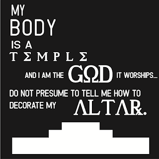
   this was was pretty fun to say the least. So, if you don't know, Typography is that live-laugh-love type stuff that your mom posts on facebook. they're cheesy, but pretty. I, personally like them, depending on the quote. so at first, we had to think of ten quotes, then pick four to make into a black and white typography. here they are: pardon their blurriness, but still. I chose lyrics that either I chose or my best friend, who loves lyrics. weirdo. I chose two basic fonts, one serif and one sans serif, which you can see are both used in the last one. I then chose some accent fonts for emphasis, which can be seen in the first three. next, we had the option to color the four we already did, or four new ones. I chose four new ones, since these looked good on their own. here those are:    I feel like I'm getting more comfortable with illustrator, considering I made that Jekyll profile with the pen tool. that heart gave me a lot of hell...

popart, featuring Boolia

Image
OH WOW. OH WOW. O H W O W. I loved doing this!!! wow!!!! This is my friend Julia, and she was a model for my popart project. I really wanted to incorporate the trees, and her hair into the design and to make it really uniform, so I found a color palette online. Our class began with going out to the courtyard and taking photos. Out of all of the many we took, this one was by far my favorite. I uploaded it into photoshop, grabbed a tablet and began my work. I decided on this green color scheme. Not only was it out of my comfort zone, but it provided a diverse amount of contrast I could have used in the piece. Thanks to multiply layers and adjustments, I could easily make the contrast even more prominent. To further the detail on shading, I used an inner shadow and outer glow setting. I also used a painterly blender brush, in order to give this some texture. I also used a screen tone to give it that pop art look. overall, I had a blast, and I want to do this so much more oft...

exploring photoshop, PhotoshopSurgeon is quaking

Image
   Oh my god I think this is the day I perish.    Okay so like, we're learning how to do photoshop on photoshop. Like... moving things around and erasing tags and acne and things I wish I could do in real life. anyway if you want some examples, here's a few:    This is Dylan! He had a bunch of dirt and blemishes on his face before the spot healing tool pulled up like me at a Taco Bell. now, he's an airbrushed little youth. What a legend. Coming for my brand.    Thanks to content aware fill, the wall is flawless!!    Thanks to the patch tool, this dude doesn't have to worry about a political shirt at his daughter's... Why did they take this picture..?    This was the hardest one, this one I had to use so many of my pervious skills to combine this into one big crock pot. I'm pretty sure I'm traumatized after that.    I learned a lot from the photoshop tutorials. I learned that some people shouldn't ma...

The Final Blog of Freshman Year

Image
This quarter was interesting to say the very least. I had to deal with so much stupidity, bullcrap and drama that I'm just so exhausted. I had to make a product with three, okay no TWO other people, since one didn't even do anything. The product was a virtual reality vine glasses, or as we like to call them, Vinels. essentially, we had to make a commercial, animation, website, and logo. we had to do so much, and I had to do most of the work.  I acted in the commercial, made some of the animations, made the logo and let everyone else do the website. the entire project took overall the entire quarter. we endured a lot of challenges. for one, out "leader" couldn't even lead, so I had to do it. second, I did a lot of the work and ideas. I probably could have done this aline. three, one of our workers didn't even contribute, and someone from another group had to help. might I add, said person wasn't even a part of our group, so I don't ...

My Very Own Logo

Image
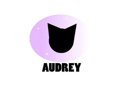
the process Let me tell you. This one was a wild ride. At first, I really wanted a lilac alien (a wink and a nod to my alias online as an artist) with clouds and stars as a gradient (to show I was up in space all the time). However, my illustrator skills are relatively sub par, and my brain just shut down at that point. So, aliens were out of the question. But what was something else that I really liked, and was simple to draw with a mouse? cats. Yes, that's right. The final logo is this: Look at her, isn't she a beauty? This logo took little to no skill at all, and doing everything took me less than a day. Isn't that crazy?! I started out by drawing a black and white version, then other different colored versions, which looked like this: imagine if I actually used one of these... The one I chose didn't have a name when I saved this, I don't know why that happened. Just ignore it. Anyway, I chose the top right one. The reason of the colors a...

The Oz Poster

Image
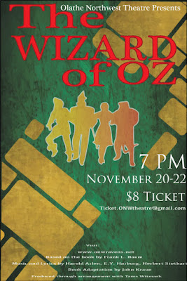
Contrast The contrast in this poster I edited can be seen in the use of red for the title, to contrast with the green and gold background. I made the characters gold, but to contrast even more, I used a gradient effect. You can also see contrast in the size of the typeface. The credits are in fine print, while the information is in a medium, white text. The title is the most important, so it's the largest. Alignment I aligned the title in a way that stands out, because it's supposed to stand out like that. the T and the  W  are aligned with each other as well, along with the Z, O, R, and   O. I did this because I didn't like how the entire poster looked when it was left aligned, and wanted it to be a little more in the center, but not exactly center aligned. I also right alines the ticket information as a form of contrast, and to show of the gold bricks drawn in the background. I center aligned the fine print in order to make room for all of it.  Repet...