Posts

Showing posts with the label kerning

typography!!!!

Image
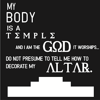
   this was was pretty fun to say the least. So, if you don't know, Typography is that live-laugh-love type stuff that your mom posts on facebook. they're cheesy, but pretty. I, personally like them, depending on the quote. so at first, we had to think of ten quotes, then pick four to make into a black and white typography. here they are: pardon their blurriness, but still. I chose lyrics that either I chose or my best friend, who loves lyrics. weirdo. I chose two basic fonts, one serif and one sans serif, which you can see are both used in the last one. I then chose some accent fonts for emphasis, which can be seen in the first three. next, we had the option to color the four we already did, or four new ones. I chose four new ones, since these looked good on their own. here those are:    I feel like I'm getting more comfortable with illustrator, considering I made that Jekyll profile with the pen tool. that heart gave me a lot of hell...
The Oz Poster

Image
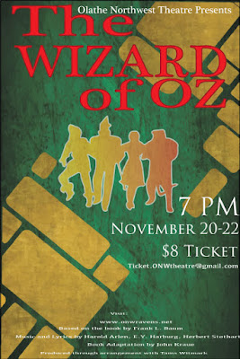
Contrast The contrast in this poster I edited can be seen in the use of red for the title, to contrast with the green and gold background. I made the characters gold, but to contrast even more, I used a gradient effect. You can also see contrast in the size of the typeface. The credits are in fine print, while the information is in a medium, white text. The title is the most important, so it's the largest. Alignment I aligned the title in a way that stands out, because it's supposed to stand out like that. the T and the  W  are aligned with each other as well, along with the Z, O, R, and   O. I did this because I didn't like how the entire poster looked when it was left aligned, and wanted it to be a little more in the center, but not exactly center aligned. I also right alines the ticket information as a form of contrast, and to show of the gold bricks drawn in the background. I center aligned the fine print in order to make room for all of it.  Repet...